pip abrigo web/ui/digital designer/developer
Methodology / Buzzurky Ads /
UI/UX Designer/Developer
"Ideation & Design" UI/UX Methodology

From ideation to research to mockups and wireframes...
Main Objective Buzzurky Ads’ main objective is to build an ad campaign system that can help improve engagement rate and guide us to new discoveries on customer behavior patterns. Another objective of this product is to gather user insights on how customers engage when asked to take surveys and quizzes, their empathy, affiliations, desires, and dislikes. By achieving these goals, the marketing team gains higher awareness of customers’ user-profile which helps them make well-informed decisions in improving their marketing strategy in the long term. There are six UI/UX design and development phases used for this project: Ideation, Research , Sketching , Wireframing, Mockups, and User Flow.

Phase 1: Ideation
There’s nothing like getting inspiration from existing online product design examples to
kick-off the ideation process. Understanding current trend ideas and standard practices
guide me to my design goals. Best sites to get some great ideas are Dribbble, Awwwards,
Pinterest, Behance, Screenlane and many more!
For this project, my first focus is to get a good pulse on what the target
customers are already familiar with in terms of good quiz/survey UI/UX design. I then
borrow some of these valuable design ideas, apply my own principles, and improve upon
them.

Phase 2: Research
The second phase is to build a conceptual user diagram called empathy map. This diagram
will assist in developing an environment to better understand and identify ideal
customer thoughts, feelings, and state of mind in regards to using a common product. And
therefore begin to gather well-informed insights on the next product improvement.
Empathy map guides my thinking pattern to focus more on how the customers would behave
and think when engaging with similar products on a deeper and personal level which could
help avoid erroneous design and functional features and position the product development
on a good start.


Phase 3: Sketching
Sketching begins the process of fleshing out the UI design ideas based on the given UX
principles and recommendations. It starts with defining basic elements and fundamental
components.
For this project, the focus is to avoid user distraction and meet the minimal
requirements including functional and business logic. This process ignites new ideas
that have not been realized as of yet and therefore we need to always keep an open mind
on what other possibilities could this new product provide.
Methodology / Buffini & Company /
UI/UX Designer
"Smart Popup" UI/UX Methodology

Display banner ads based on user's profile info...
Main Objective
Smart Pop-ups’ main objective is to better serve each member and non-member visitor with
relevant profile-based informed messaging thus improving customer engagement rate. By
leveraging existing user/customer data systems, we are able track customer
user-engagement data where a point-system algorithm can be built upon that can trigger
custom messages timely based on user’s interaction with the site’s content. By achieving
these goals, the marketing/design team gains higher awareness of customer behavior
patterns when engaging with targeted promotional ads. There are six UI/UX design and
development phases used for
this project: Ideation, Research , Sketching , Wireframing, Mockups, and User Flow.
 Ex: Empathy map
Phase 1: Ideation
There’s nothing like getting inspiration from existing online product design examples to
kick-off the ideation process. Understanding current trend ideas and standard practices
guide me to my design goals. Best sites to get some great ideas are Dribbble, Awwwards,
Pinterest, Behance, Screenlane and many more! For this project, my first focus is to get
a good pulse on what the target customers are already familiar with in terms of friendly
non-intrusive popup ads. I then borrow some of these valuable design ideas, apply my own
principles, and improve upon them.
Phase 2: Research
The second phase is to build a conceptual user diagram called empathy map. This diagram
will assist in developing an environment to better understand and identify ideal
customer thoughts, feelings, and state of mind in regards to using a common product. And
therefore begin to gather well-informed insights on the next series of product
improvement. For this user empathy map research, the focus is to define user known and
trending attitudes and impressions of pop-up ads including their desires and dislikes to
prevent high volume of distress and anxiety while engaging with the product. This
research also helps determine the pain points and rewards if the product is designed and
executed timely and efficiently.


Phase 3: Sketching
The phase three portion deals with low-fidelity visual ideation, representation and
overall proposal of the potential look and feel of the product in development. The visual
examples above show the initial layout display, presentation, and concept of
the product including its general function, purpose, positioning, and content treatment.
Here also shares the fundamental concept and objective of the product which is to
hyper-target a current user based on the record of user engagement history and data.
Methodology / White Label Product /
UI/UX Designer
"Simple Flow" UI/UX Methodology

Reduce user effort when booking a conference room...
Main ObjectiveThe main objective is to better serve each member,
client, customer and visitor with a simple and easy
online room reservation tool to improve customer
relationship and engagement rate.
By understanding the demographic target’s attitude,
thoughts, and feelings toward online room
reservations, we can determine the best UX/UI design
strategy from structure to functionality.
By achieving these objectives, design & development
teams gain higher awareness of customer behavioral
patterns when engaging with online reservation tools.
Below are the UI/UX design and development phases
used for this project: Ideation, Research, Sketching,
Wireframing, Mockups, and User Flow

Phase 1: IdeationThere’s nothing like getting inspiration from
existing online product design examples to kick-off
the ideation process. Understanding current trend
ideas and standard practices guide me to my
design goals. Best sites to get some great ideas
are Dribbble, Awwwards, Pinterest, Behance,
Screenlane and many more!
For this project, my first focus is to get a good
pulse on what the target customers are already
familiar with in terms of friendly and easy to use
online reservation tools. I then borrow some of
these valuable design ideas, apply my own
principles, and improve upon them.
Phase 2: Research
diagram called empathy map. This diagram will
assist in developing an environment to better
understand and identify ideal customer thoughts,
feelings, and state of mind in regards to using a
common product. And therefore begin to gather
well-informed insights on the next series of
product improvement.
For this user empathy map research, the focus is
to define user known and trending attitudes and
impressions of online room reservations including
their desires and dislikes to prevent high volume
of distress and anxiety while engaging with the
product. This research also helps determine the
pain points and rewards if the product is designed
and executed well and efficiently.


Phase 3: Sketching
The phase three portion deals with low-fidelity
visual ideation, representation and overall
proposal of the potential look and feel of the
product in development.
On the visual example above, it shows the initial visual
display and presentational concept of the
product including its general function, purpose,
positioning, and content treatment.
It also shares the fundamental concept and
objective of the product which is to minimize the
effort and the steps a user has to take in order to
complete a transaction.
Digital Design / Open Frames Project / Web/Digital Designer
"Storytelling"
Web/Digital Design

Tell a simple but compelling story
The founder of The Open Frames Project wanted to emphasize both the beauty and the darkside of human stories, as characters that represent emotions behind his stories and the people around him emerge on the page. By using certain combinations of warm colors, the user can feel the tone of emotional prism. Sometimes telling a story on a page can be subtle and simple but adequate enough to make that first connection and hopefully a good first impression.

Digital design also involves a huge amount of copy management.
Without losing the main focus to tell a story, positioning and treatments of subtitles
and body paragraphs must also contribute to the balance and the overall presentation as
one whole unit. Consistency in wordsmithing patterns is an absolute must. These patterns
act as instructions on how to consume the content. And choosing the most effective words
is vital to achieving this objective.
This works-in-progress design project will soon be published in the near future. During
that time, there will be more adjustments and modifications to be made including adding
more media and content to the mix. The hope is to maintain the integrity of this product
design’s main objective, which is to bring about the perception of storytelling with
simple but subtle elements including compelling imagery and warm colors to evoke
emotions, connections and trust.
Digital Design / Kearny Commercial Real Estates /
Web/Digital Designer/Developer
"Content Structure" Web/Digital Design

To use architectural shapes and structure to set the theme
The client’s industry is in Commercial Real Estate. So, I chose to maintain the architectural element along the design progression. By emphasizing the common shapes from these familiar and contemporary building structures, the user can immediately generate an impression of the type of staff and individuals who run this organization. The intention is to emit the feel of sophistication, professionalism, durability and security.

Starting from the surface of this particular design, I wanted to
evoke attention by using shapes and contrast. But I also intended to be clear and
concise with the messaging by highlighting a text element (“$4.5 BILLION.. “) which
suggests stability and strength. Along with this are the buildings and skyscrapers that
add to the prime message of the design on behalf of the organization, which is “Trust in
us.”
The significance of this design decision goes beyond aesthetics and branding, it has
more something to do with building trust from the very beginning. This has been a very
common goal shared by very many designers and marketers. Because trust is where
everything we want our customers and members to settle in. To feel the trust is to make
peace with themselves.. means that the product that they are engaging with will always
consider their best interest at heart.
Digital Design / French Oven Bakery /
UI Designer/Developer
"Colors & Contrast" Web/Digital Design

Generate interest and wonder using colors and contrast
In product design, I always want to remind myself that the sense of
sight is not the only human sense that these visual representations must evoke. In order
to make the connection and gain the attention that the product needs and deserves, the
designer must understand that the more the design ignites human senses, the closer it is
to completing the mission to win a user's trust.

For this design project, the idea is to compel the new visitors and
returning customers to engage on a regular basis. Become a loyal customer who always
comes back for more. And to achieve this, it means the design needs to encourage the
feeling of attraction to these baked goods and products. So, by taking advantage of the
richness in colors of the chosen imagery, the user develops a certain instinctive desire
to connect. The idea is for the viewers and customers to feel enticed by the products
and everything associated with them, including the feel of the raw ingredients and the
sweet smell of freshly baked bread.
More often than not, when designing a theme, in this case for a website product, the
designer must always think beyond conventional objectives which are to inform, present,
and communicate. The usual fundamental visual objectives should always facilitate
further ideas and opportunities to connect with the customers on a deeper emotional
level. Bypassing the visuals, users must feel the appropriate emotion from their
curiosity on what it feels like to buy and experience the offer.
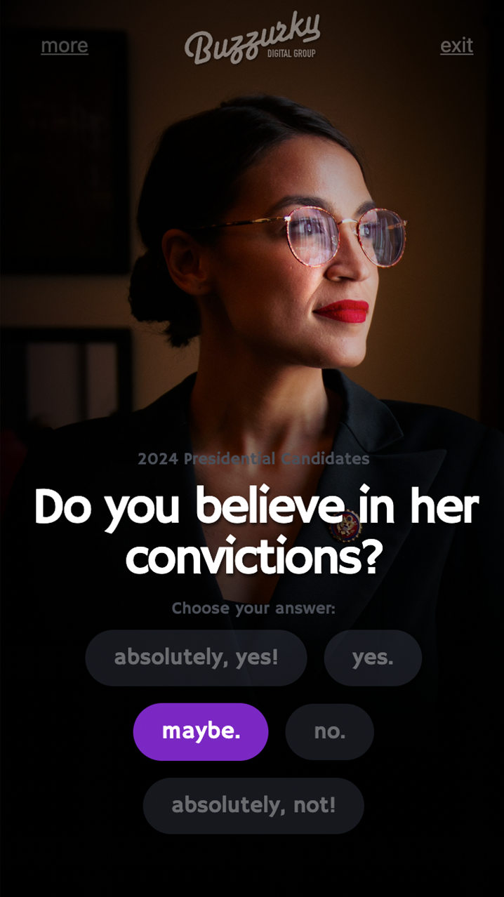
product design / Buzzurky /
UI/UX Designer/Developer
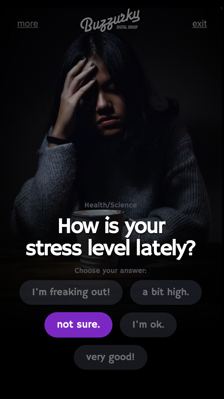
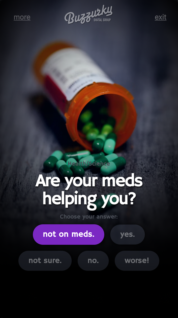
"Quizzes/Surveys" UI/UX Product Design
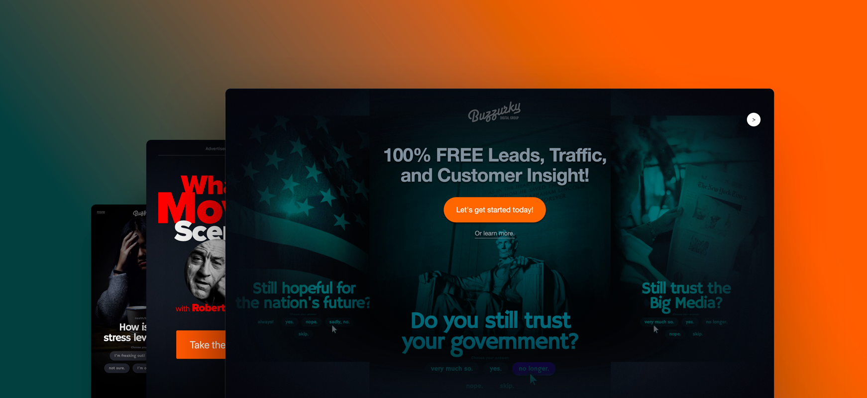
Increase user-engagement and lead conversions
Not surprisingly, most of our common goals in this online-business world would
eventually lead to achieving that high conversion rate. Conversions mean revenue and
revenue is one of the most important goals besides high user-engagement. Without high
user engagement, there will be no conversions and no conversions means no revenue.
However, a high user-engagement requires some creativity and planning. There are several
attributes and features of this product design, benefiting both the business objectives
and effective user-experience.
See demo
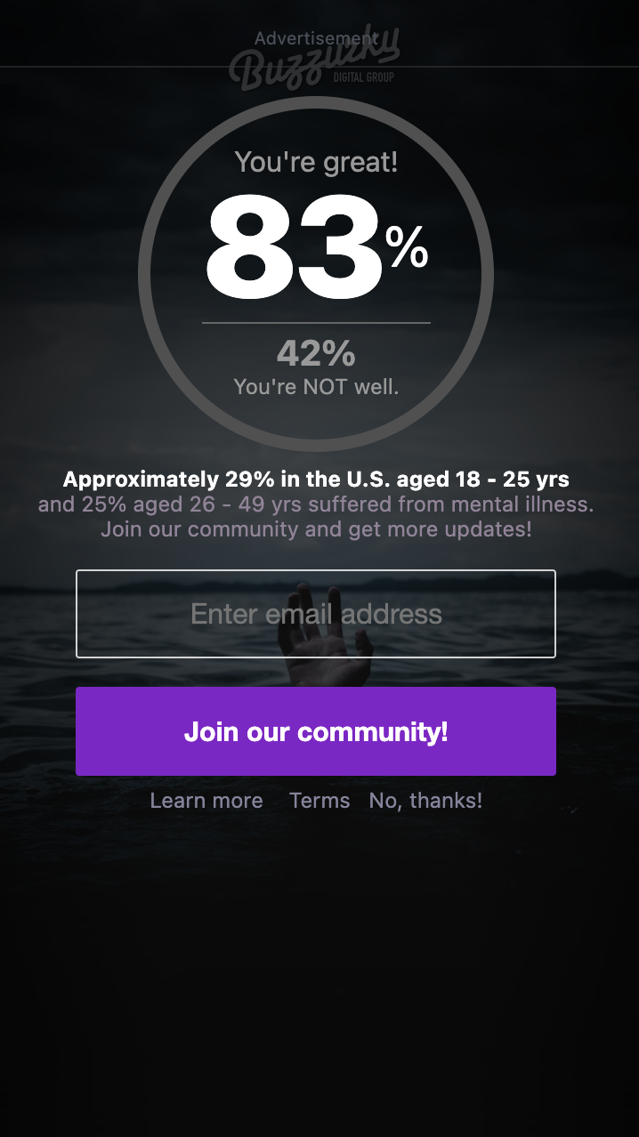
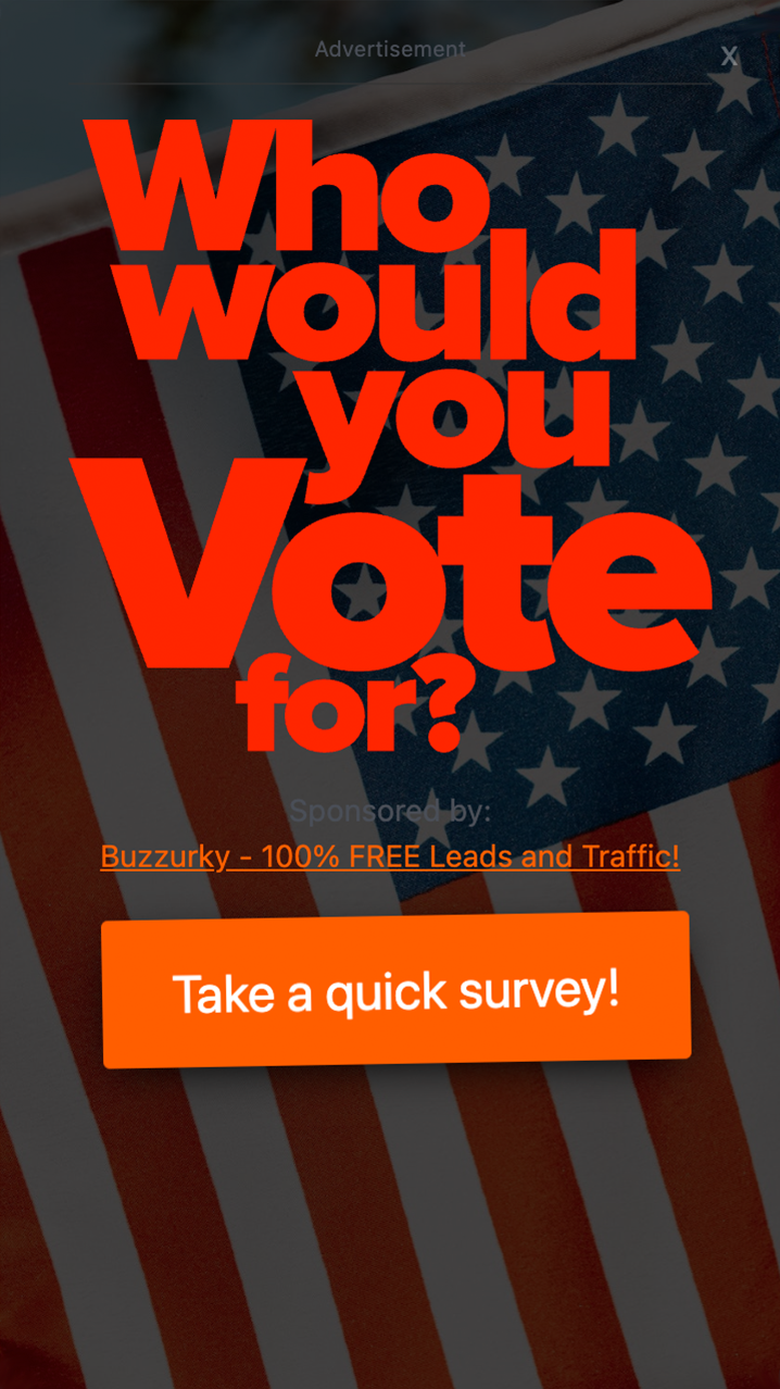
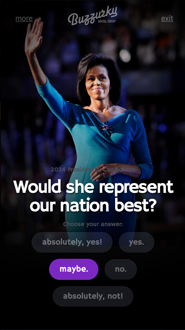
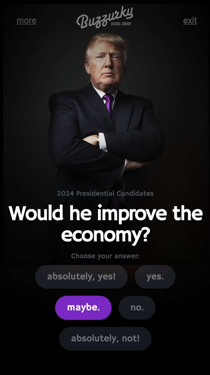
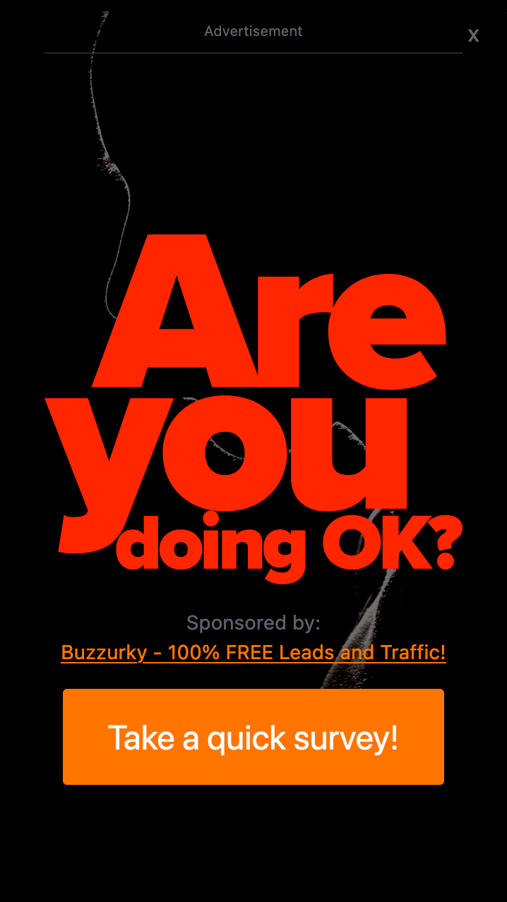 Quizzes & Surveys
The key element in the product’s objective to maintain a high user-engagement rate is to
use the “Quizzes & Surveys” method, a solution that not only provides entertainment but
also encourages the users to engage in exchange for valuable data and
information.
Quizzes & Surveys
The key element in the product’s objective to maintain a high user-engagement rate is to
use the “Quizzes & Surveys” method, a solution that not only provides entertainment but
also encourages the users to engage in exchange for valuable data and
information.
Using this method allows the possibility of acquiring relevant customer insights and
information that can only be achieved by asking users pertinent questions about
themselves and their opinions.
Branding & Awareness
This design feature provides the ability and the oppurtunity to build user-trust and
brand association, crucial elements in generating engagement and igniting business
transactions.
 Lead Generation
Well, if it isn't the most discussed topic among online and digital marketers since the
invention of the internet business! And therefore, one of the most valuable features I
had to incorporate in this product design is the ability to gather contact information
directly from users who appreciate and enjoy the product’s engagement features.
Data Gathering
At the very least, most marketers do not consider this seriously enough. I designed a
built-in system that could help predict customers “wants and desires” by collecting and
storing valuable information. This allows marketers to acquire insights, knowledge and
understanding on how to improve the product and further increase user-engagement. Each
answer gets added to the data schema for analysis and reporting.
Lead Generation
Well, if it isn't the most discussed topic among online and digital marketers since the
invention of the internet business! And therefore, one of the most valuable features I
had to incorporate in this product design is the ability to gather contact information
directly from users who appreciate and enjoy the product’s engagement features.
Data Gathering
At the very least, most marketers do not consider this seriously enough. I designed a
built-in system that could help predict customers “wants and desires” by collecting and
storing valuable information. This allows marketers to acquire insights, knowledge and
understanding on how to improve the product and further increase user-engagement. Each
answer gets added to the data schema for analysis and reporting.
Content and Digital Marketing Community
It is most likely obvious that Buzzurky Ads is designed for online and digital marketers. The product’s core intention is to provide marketers a simple yet effective user-engagement tool that is easy to use, affordable and versatile. There are several sectors of the industry that could most benefit from the design features of this product.
See demo
 Digital MarketingThese marketers want something that is built to dazzle and
allure potential customers on first sight. In this high-competitive nature of online
advertising, they need something to not only gain an edge but to also provide insights
to achieve their goals.
Digital MarketingThese marketers want something that is built to dazzle and
allure potential customers on first sight. In this high-competitive nature of online
advertising, they need something to not only gain an edge but to also provide insights
to achieve their goals.
Content PublishingOnline authors and publishers could need an extra boost
in presentation on their newest work. Buzzurky Ads creates dimensions, intriguing
factors, and of course the ability to gather valuable information that takes their
marketing campaign to the next level.
Marketing & Advetisement
An absolute tool for all-around marketers and advertisers! Designed for smart marketers
who understand that “attention” and “engagement” are the first highest priorities in
line.
Buzzurky Ads needed something unique that marketers use to achieve their goals and also
find it useful on many levels of their marketing and business strategies. It is a
marketing tool designed to explore and discover!
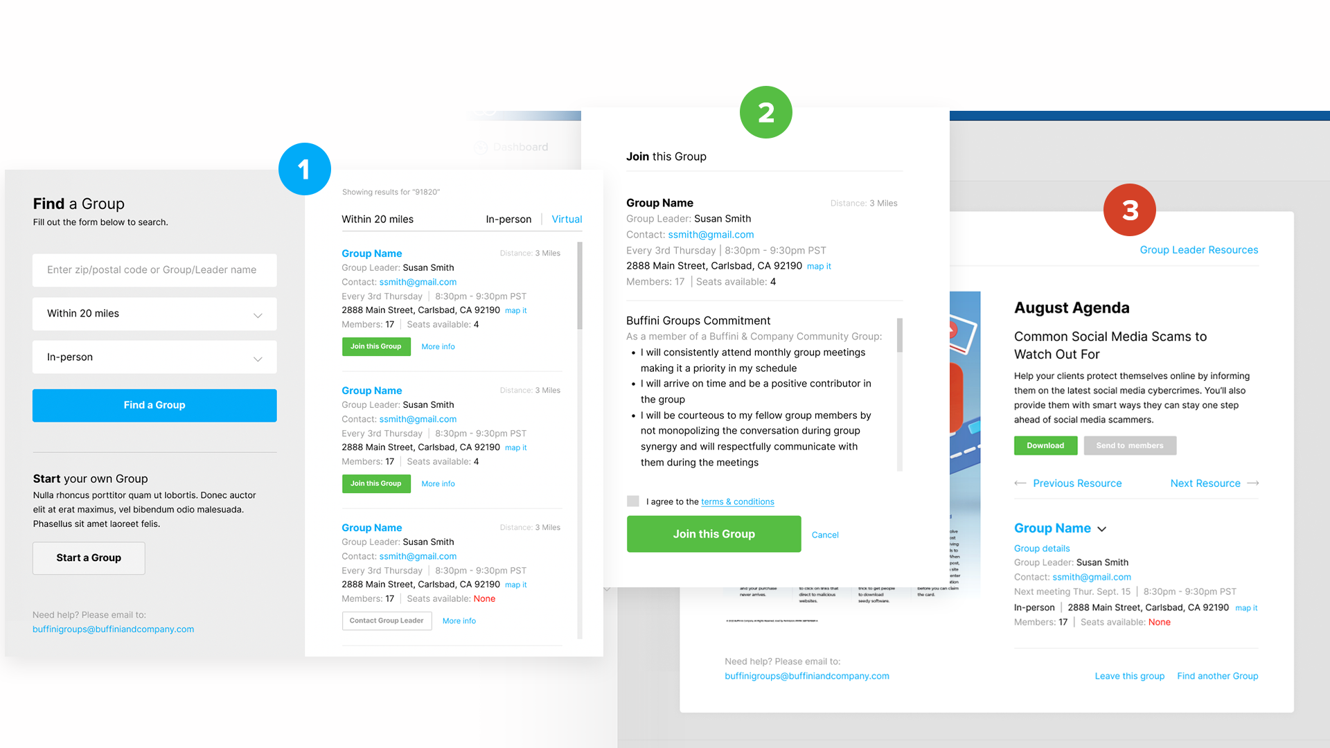
product design / buffini & company /
UI/UX Designer
"Search & Find" UI/UX Design
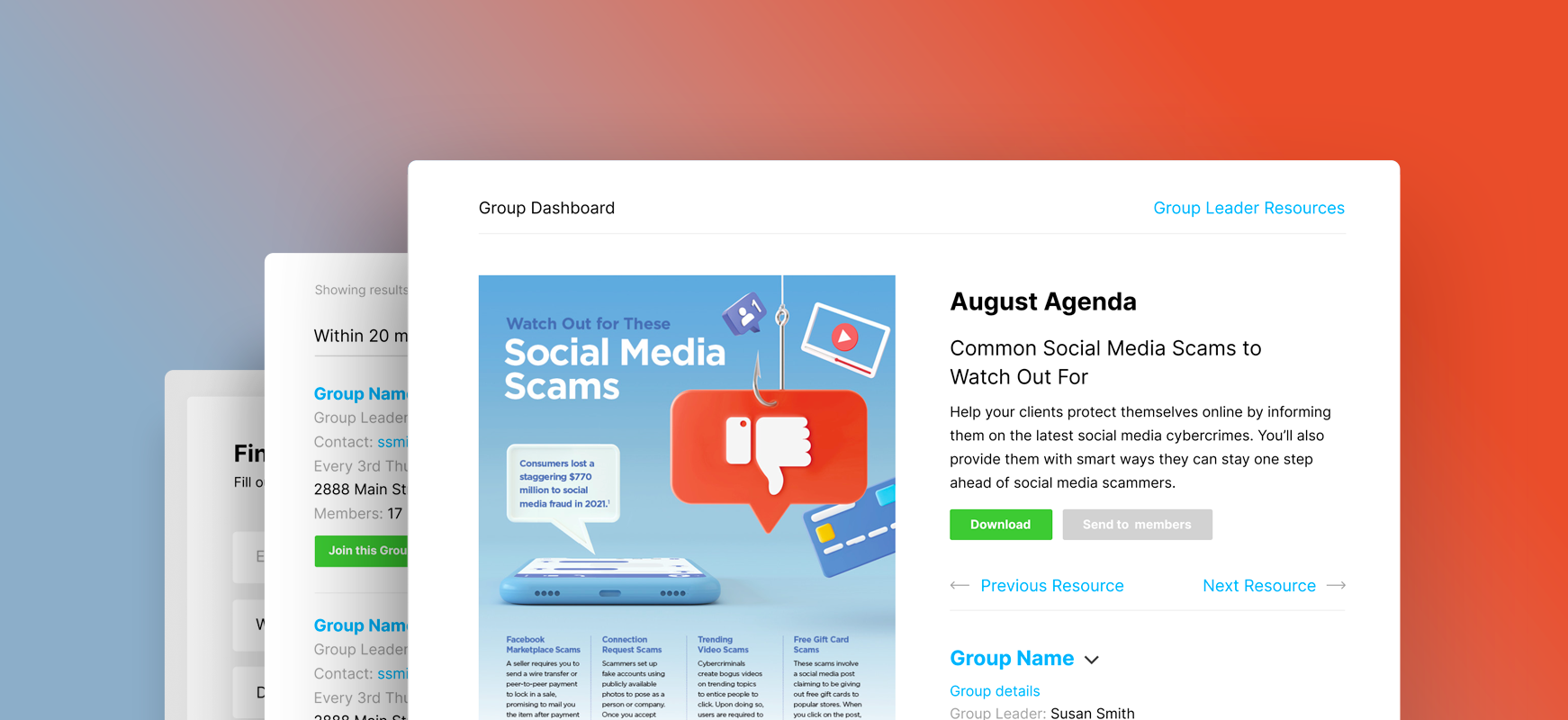
Increase engagement rate with simple and friendly UI
The company’s flagship membership product needed a new facelift on one of its key features. Besides the lack of aesthetic in the presentation, most importantly, it needed an intuitive user-experience that informs and encourages the users to engage and connect with groups of like-minded individuals. So I made the decision to simplify this feature even more by modifying the UI components and elements and their functions.
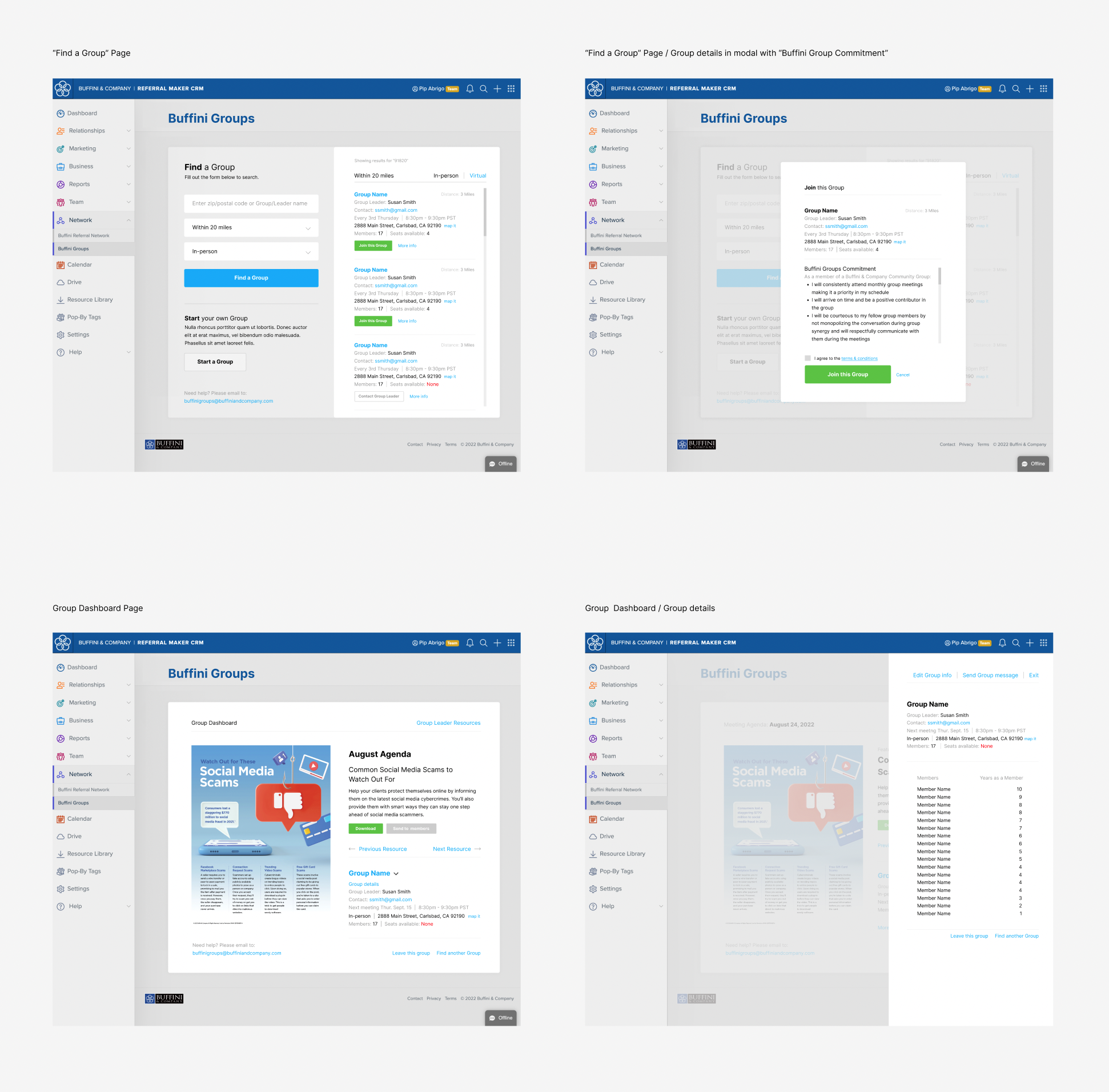 Product Design Best Takeaway
Simplicity makes communication less complicated
If there’s one thing I learned (or relearned) is that “less is more” and “more can
complicate things” even more! The core objective of this product design approach comes
from the desire to provide a better user-experience by removing any element including
colors and contrasts that can potentially reduce user interest and attention.
So, by minimizing the use of highly decorative elements and only using the right type
and amount of any particular element that can also be used as a decorative element, the
overall outcome of the UI design becomes so minimal yet it creates an easy environment
to move around and figure things out from a user’s perspective.
product design / Buzzurky Themes /
UI/UX Designer
"Theme Design" UI/UX Design

Simplify UI design with simple base structure
We’ve often heard the term “build a good foundation” in all of our never-ending design discussions and debates on best-practice and what should be the status quo. And the word “foundation” to be one of the most revered keywords in the tech industry’s encyclopedia. It’s all about the base and how to design and build a product from the bottom up. So I strongly believe that having the understanding how significant a good foundation is and the devotion to designing the strongest roots to secure this foundation should always be the starting point.

This project involves designing a product that is the main theme for a dynamic web
application. Designing a UI “theme” for this product from scratch, I decided to mockup a
skeletal structure of empty placeholders. Much like a blueprint without the complex
mathematical equations.

My reasoning for this approach is to simply demonstrate a clear division of content
based on their hierarchy and importance early on in the design process. It is to
everyone’s benefit to develop a system of grouping in order of importance before moving
forward to the next stage.

The underlying base UI structure is also meant to clearly display which section is the
prime location for the most featured content on display and which ones to come in a
progressive order based on their value and importance.